


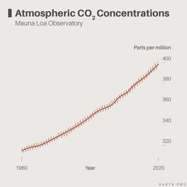
The Keeling Curve is a graph of the longest uninterrupted record of atmospheric CO2 levels on Earth. The data comes from the work of Charles David Keeling of the Scripps Institution of Oceanography, who managed sampling efforts at Mauna Loa, Hawaii, between 1958 and 1964.
—
Why is it important?
First, it is one of the most recognized successful examples of a long-term study, giving it academic value. But beyond this, it is the connection between modern CO2 concentrations and those of the past, and here is why.
We were able to measure CO2 (and other atmospheric molecule) concentrations as far back as 800,000 years ago thanks to air bubbles trapped in deep layers of very old ice at the poles. Keeling instead used direct sampling with what is now called Keeling flasks. Surprisingly, they are still in use today: “Hold your breath and walk into the wind, then open the valve,” says Tim Lueker, a researcher in the CO2 Research Group at Scripps Institution of Oceanography, UC San Diego.
The Keeling curve also came at a turning point when atmospheric CO2 concentrations, stable for centuries, suddenly began their rapid increase from ~280 ppm to the present 411 ppm. It is part of a small collection of studies that provided early signs of climate change’s emergence.
The Keeling Curve Pattern
The Keeling curve is defined by its choppy, repetitive pattern, one of two found by Keeling and his colleagues.
As their study progressed, Keeling and his team began to notice patterns. CO2 levels were higher at night than during the day, which he attributed to plant photosynthetic activity. Over the course of a few years, they noticed an even larger scale pattern: CO2 levels are highest in the Spring, and lowest in Fall, or vice-versa in the northern hemisphere. There are far more plants in the north than in the south, so CO2 consumption peaks during Spring leafing and drops in Fall dormancy.
The world now looks to the Keeling curve as the main reference for global atmospheric CO2 levels. It has gone from a warning to a record-keeping tool that we will be able to look at with pride when we will have cut emissions enough to slow or even stop the curve’s upward slope.
This article was written by Owen Mulhern.
You might also like: The 9 Biggest Fast Fashion Statistics
![The Statistics of Biodiversity Loss [2020 WWF Report]](https://earth.org/wp-content/uploads/2020/12/lprwinkyTHB-544x306.jpg)


