Is there a connection between cattle methane emissions and the total usage of different synthetic agricultural fertilizers in the United States? This is what the data says.
—
When looking at the greenhouse gases that are driving climate change, one that is often brought up is methane (CH4). Methane is the second most abundant human made greenhouse gas after carbon dioxide (CO2) and it is 28 times more potent at trapping heat in the atmosphere.
Methane is produced from a variety of anthropogenic sources, such as landfills, oil and natural gas systems, and coal mining, with agriculture being the largest source, accounting for 40% of global methane emissions. Cattle, which is widely consumed in Western diets and primarily in the US, accounts for the largest share of these emissions – around 75%.
Multiple factors drive these livestock emissions, but one overlooked variable is the role of synthetic fertilizers used to grow the massive amounts of feed crops required to sustain these cattle. In this analysis, we look at the historical data of synthetic fertilizer use in the US to see if it can act as a reliable predictor for the country’s cattle methane footprint.
The Data: Fertilizer vs. Methane
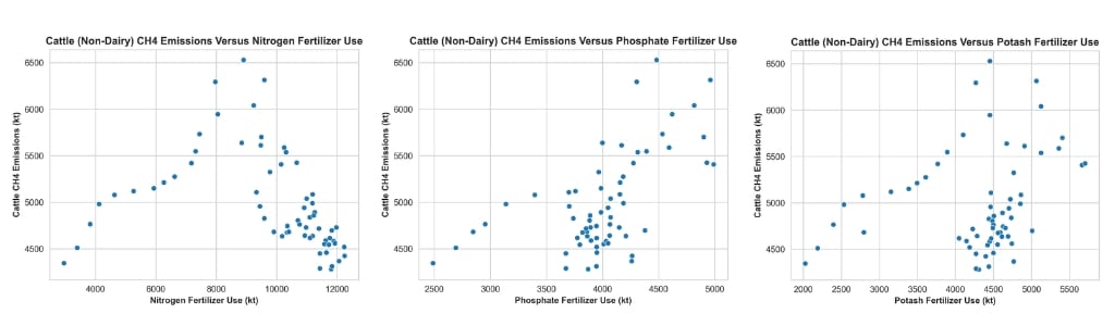
To find a pattern, we pulled historical data from the Food and Agriculture Organization (FAO) spanning 1961 to 2023. We tracked the US agricultural consumption of three common fertilizer types: nitrogen (N), phosphate (P205), and potash (K20).
We compared these numbers against methane emissions specifically from beef cattle, which carry a much higher carbon footprint than dairy operations. Our goal was to see if changes in fertilizer use directly mirror shifts in methane output.
Before running a deeper statistical model, we plotted the raw data on scatter plots to visualize the trends. As seen in Figure 1, beef cattle methane emissions steadily increase alongside rising phosphate and potash usage. Interestingly, nitrogen fertilizer shows the opposite trend – suggesting that phosphate and potash have a much stronger, direct correlation with the US cattle footprint than nitrogen.
After the scatter plots were produced, the data was split into train and test sets, with 70% of the data being used to train it and 30% of the data used to test it. The train set is used to help the model learn how the data is set up and build a model with it. The test set is used to help assess the performance of the model with a less familiar data set than what was used to build it.
The linear regression models were then built, and key parameters were found to help interpret the results. One of those is the r2 value (coefficient of determination), which measures how well the model to predict methane emissions fits the data that is provided. Another parameter that was found is the mean squared error (MSE), which provides a way to assess accuracy by measuring how close the predictive linear model is to the actual data. The r2 and MSE values for both the train and test data for the three fertilizer regression models are displayed below.
| Fertilizer type | r2 (Train) | r2 (Test) | MSE (Train) | MSE (Test) |
| Nitrogen | 0.058 | 0.212 | 309576.721 | 123929.114 |
| Phosphate | 0.405 | -0.051 | 195435.236 | 165238.180 |
| Potash | 0.085 | -0.151 | 300821.344 | 180896.238 |
As we can see in Table 1, the phosphate model had the highest overall r2 value with the train data and the nitrogen model had the highest r2 value specifically with the test data. There were some differing positive and negative correlations with the phosphate and potash models with the train and test data, but the train data (which represents a higher percentage of the data) resulted in a positive correlation between the two variables in all three models. For the MSE values, the nitrogen and potash models had higher values than the phosphate model which means the points in the data for the former model prediction lines are not as close to the latter (the phosphate model), but overall there is still some degree of correlation when we take the r2 values into consideration.
Regression lines were also plotted for the three models, with the train data highlighted in blue and the test data highlighted in green for each graph in Figure 2. We can see that the trend lines point upward for the phosphate and potash models, but the nitrogen line points downward, indicating that the higher variability in the methane emissions versus nitrogen data resulted in a slight downward trend compared to the other two fertilizers.

Final Thoughts
Addressing the original question of whether there is a relationship in the data between cattle methane emissions and the total annual usage of different synthetic fertilizers, the results demonstrate somewhat of a correlation, particularly for phosphate and potash. However, nitrogen fertilizer showed an opposite correlation and did not follow the expected upward trend, which could be due to a few potential causes.
One possible cause is that methane emissions from cattle are typically more tied with their digestive process– known as enteric fermentation – in which microbes in the digestive system decompose food and produce methane as an output. According to the US Department of Agriculture (USDA), increasing efficiencies in fertilizers like nitrogen could lead to a reduction in methane from those processes. However, there is still no evidence to suggest that the total usage of those fertilizers directly correlates to total cattle methane emissions.
Another point to consider for the mixed results is that the greenhouse gas outputs of different synthetic fertilizers typically release different direct outputs, such as nitrous oxide (N2O), which is directly released from excess nitrogen fertilizer usage, rather than methane. Because potassium and potash fertilizers do not contain carbon or nitrogen in them, they typically do not release a large quantity of greenhouse gases as a direct byproduct, although they may release them indirectly through other lifecycle processes, such as in the processing and transportation of those fertilizers.
There are several ways in which this analysis could potentially be expanded upon, such as investigating additional high-emitting livestock like lamb and goat instead of cattle and different greenhouse gas outputs such as carbon dioxide and nitrous oxide instead of methane. Additionally, the usage of different fertilizer products such as ammonia and sodium nitrate could be examined to see if there are additional correlations to be drawn.
As emissions of different planet-warming greenhouse gases from agricultural processes continue to increase, looking into these types of correlations provides key information to guide climate change mitigation efforts.
This story is funded by readers like you
Our non-profit newsroom provides climate coverage free of charge and advertising. Your one-off or monthly donations play a crucial role in supporting our operations, expanding our reach, and maintaining our editorial independence.
About EO | Mission Statement | Impact & Reach | Write for us